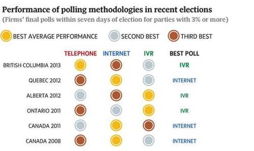
And, "In some segments – especially young voters – land lines are as archaic as the rotary dial to an earlier generation." We saw this happen with the polling numbers for the 2010 Calgary municipal election - Nenshi was a 'surprise'...Only because the pollsters weren't talking to his constituents and either weren't looking or underestimated his Social media push.